 Few weeks ago I published some „plasma fibres“ illustrations on Forst and Dribbble and promised that I will also publish a simple tutorial, how to do it. So now the tutorial for Adobe Illustrator is finally here!
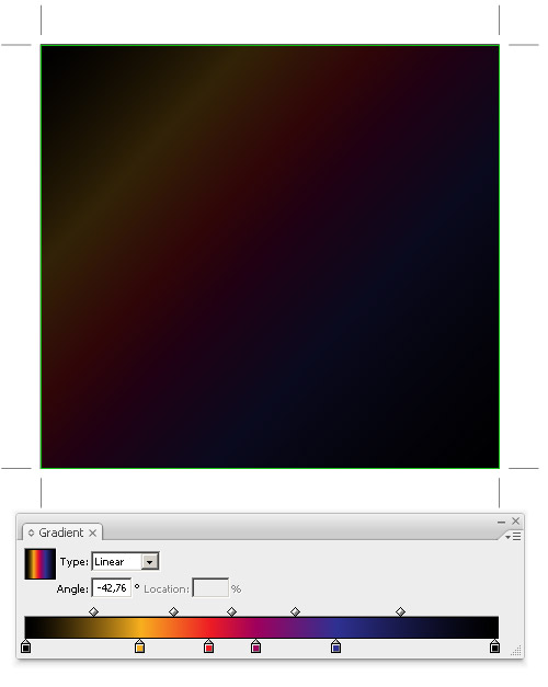
The first step is creating the background, which consists of 2 layers (rectangles). The bottom one has a black color. The upper one contains colorful gradient – you should use colors that the final objects on the illustration should contain. I used black – yellow – red – blue – black gradient.
For this upper layer we set the transparency to 20% so the background will be nearly black.
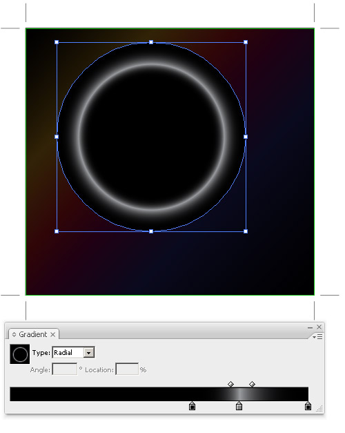
After that we can start with main objects – create a circle without a stroke, filled with circular black and white gradient (used colors are: black, 50% gray, black) – see the picture:
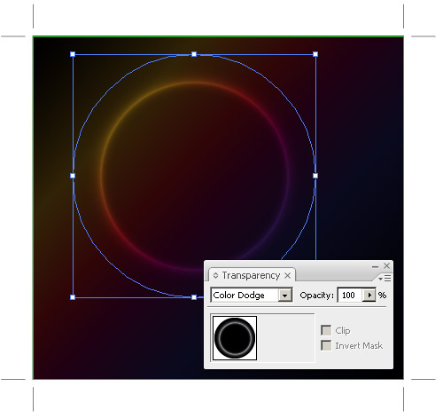
And now the main trick! Change the opacity to Color Dodge. This opacity mode will highlight colors of underlying layers (the lighter shade of the upper object will cause brighter color on the background layer).
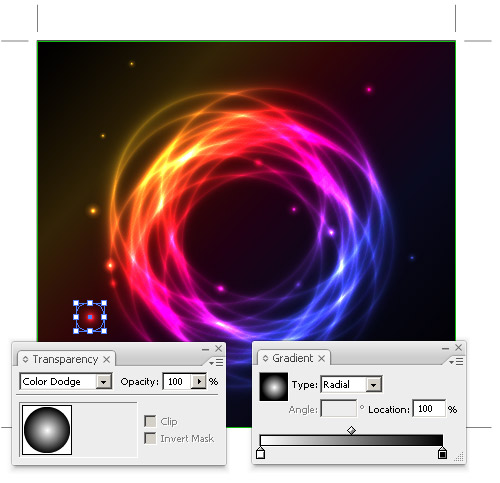
Now we just create other objects – you can duplicate the one we created or you can draw some new ones. The color will be much brighter where those objects overlap, so I prefer to use darker shades of gray.
We can also add some „stars“ – stars are just circles with basic circular gradient.
You should also play with the effect and try to draw various objects and use the gray gradients, gradient mesh or gray brushes.
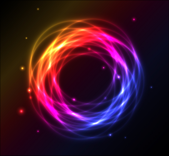
Final illustration
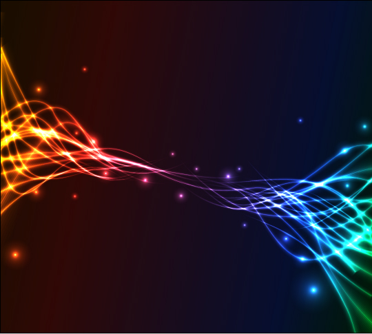
More examples of this effect

Although I don’t do illustrations, this is pretty interesting!
Thanks for posting.
Excellent !
And very simple
Thanks :-)
Been beating myself up this weekend trying to master this technique but somehow when I change the opacity to color dodge the blacks surface the rainbow and the grey changes to bright white. Help please. BTW…awesome job bro.
Your color dodge doesn’t work.
RGB mode instead of CMYK and it works fine
Ah, learned something new. Yes, now it works. TY Marodziej. Slight omission by orson.
super….
Dantana, you may be right, my color dodge is probably broken :)
I changed to CMYK but same results. Im using CS2 software. I also tried separate layers vs. (1) layer with multiple forms on top of each other.
I guess I need to keep on keepin on and figure this out. Thanks to everyone that has chimed in to help out!
It worked pretty well for me, but I had some troubles applying the Transparency, someone could explain me how to use 20% of transparency to make the background looks darker…?
Thank you!
I have yet to figure out how the author of the tutorial was able to achieve the effect in the last 3. To achieve this effect the lines need to have a gradient and the only two ways I know of applying a gradient is the the linear/radial gradient as well as the gradient mesh, neither of which i feel were used. Can anyone help me?
I got a completely different outcome and can’t figure out what I did wrong. I followed everything you said but no dice. I’m using CS5.
http://danielerossi.ca/Untitled-1.jpg
it appears you are using cmyk instead of rgb daniele
Arg! :) Thanks Eric.
Nooo, Daniele you can use CMYK, but you have to fill the 4 channels with the same percentage. Now talking about the other examples someone knows how/which tools should I use to do those curves with Gradient? I tried with Mash tool, there is another easy way to do that?
no matter what i do my circle just turns a shade of grey, help me out?
this is just awesome! thank you for sharing. :)
Pane Václavku, perfektní tutorial! Moc děkuji, stále jsem si lámala hlavu, jak dělat tak krásné ilustrace a přitom je to tak jednoduché. Skvělá práce!
hi Eric i found a way to do the 1st its not that hard tho.
1st you make a rectangle 250×3 px
copy it and paste in place make the 1 on top 200×0,01 px make sure u keep them centered.
now select both objects and go to Object- blend- make.
now u have a sort of gradient wich u can shape any way u want making the curves.
what I like to do is make it a brush and that way u can use it with pen or brush tool.
hoop I helped you out here my english isnt that good since im dutch
I tried this and the change transparency to color dodge didn’t work, And i read the comments and tried changing it to RGB which I did do and still it does not work. =/
I’m using illustrator cs5. Any help would be appreciated.
May our Heavenly Father & Jesus bless you.
Never mind I closed it out and made a new document and it’s when you make a NEW document in CS5 you change to RGB mode and THEN it works.
Thank you for posting.
To Willianvazz
What you do is you hit the transparency panel usually below the gradient panel and you adjust the „Opacity“. This affects all gradient colors of the square. If you do this in the gradient panel this only the colors you change the opacity of.
Also i noticed my circle didn’t look the same as the tutorial so i had adjusted the black colors of the circle to 0 opacity (in the gradient panel) so you can only see the glowing colors and not a semi transparent black circle with it.
May our Heavenly Father & Jesus bless you.
I am playing with this effect and the results are very cool. But more complicated images has got large size after exporting to eps 10. So they exceed the 15MB limit for SS. But I see similar images from other contributors, also complicated, in SS gallery and they are vectors. So there must be some way to reduce file size under 15MB.
I tried remove swatches etc., reduce size (format), and other common adices to reduce eps size. But when I use „color dodge“ in more complicated image, the eps size is very large (50MB and even more).
Any ideas please?
Hi LK I had some issues like that. Simplifying your shapes helps a bit. I had to do that to be able to move the vile faster because when I expanded the strokes & whatnot it got really complex so I had to simplify it since theres so many layers. doesn’t help that much. Trying to figure the rest out. Good luck.
May our Heavenly Father & Jesus bless you.
hi to make the background more darker…
transparency option make the opacity 20% and change it to multiply… youll see it have better result
Thank You so much.. i have been looking for this kind of effect for a long time…
Hi, I got one big problem when working with soft gradients and color dodge mode. When I apply color dodge, the gradient underneath it becomes distorted – it has stripes. The gradient is not fluent anymore, there are visible gradient steps. I thought vectors are purely scalable.
Screenshot:
http://i50.tinypic.com/14aez41.jpg
How can I avoid this distortion ?
Thanks.
I have a perfect result…but…i need make a energi line, not circle…but how i can?
The circle working with radial gradent inside…how need manage the line for have some effects?
William, the system is same – you just need to do a gray gradient on the line. So either create your own brush, or just use some Blend.
Beautiful effect, but I can’t use it – even just adding a few stars with colour dodge makes the .eps file size explode to over 170 MB (from less than 1 MB before). Am I doing something wrong, is there a way to prevent this happening?
For some reason while working on the first circle the color gradient of the second rectangle changed from linear color gradient to radial black and white. This could be related to have the wrong layer selected at some point while working on the first circle.
You notice something went wrong when you apply color dodge blending mode to first circle and see no colors coming through.
A secure way of avoiding this is by locking the second rectangle as soon as you finished setting up the gradient colors on it.
when I change the circle to colour dodge and unselected the circle I have a dark circle border around the highlighted line and the highlight circle line is not very bright!!! what am i doing wrong?
also mine does not look dark in the centre like the ones shown – the colour comes through?
Děkuju pane Vásclavku za skvělý tutoš, po dohledání a vyřešení podobných situací jako měli ostatní ve vláknu, mi to funguje….báječné